Weeks 4&5
24 October - 6 November
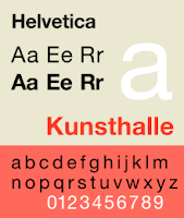
 Entering into early modernism we meet the Bauhaus movement which seeked to unify art, craft and technology. This was the first time that the industrial age had a visual language where typography was describing brands (what we now call graphic design) and commerce was driving the industry. In this modern world it was encouraged to move 'onwards and upwards'. And the world of typography was definitely propelled forward with the creation of the font Helvetica in 1957 by Max Miedinger
  This was the ultimate expression of modernism; a dynamic font that could be interpreted and used wherever, in whichever scale with it's form then being followed by the desire function. It was thoroughly used in company logos. The wonder being that it created a competition of neutrality vs. Elegance.
A font so admired in the creative world, that Microsoft took it 25 years later for themselves (supposedly after this time there are no copyright infringements so long as you change the subject slightly). I think they really did the absolute bare minimum to make their new font: Arial.
They really didn't even try to pretend did they.
1994 showed a quick demise of well, the world, because all of our eyes have since been cursed by Comic Sans.
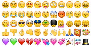
The introduction of Internet Explorer (thank you Bill Gates) in 1995 saw a kind of 360 as the use of images and pictures (emojis) as words returned. This is reminiscent of what we can see by the use of pictures in Egyptian hieroglyphics.


No comments:
Post a Comment